 The Wytt Morro Collection The Wytt Morro Collection
Wytt
Morro (1922- ) was the son of a prominent Adelaide commercial artist.
His early training was with Vardons, the largest commercial printing
house of the time, and later he joined his father to found the firm,
Wytt Morro & Son. There he specialized in packaging design and
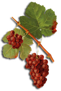
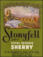
began to do work for Stonyfell Wines. His first label included a view
of the Adelaide plains which Morro sketched himself.
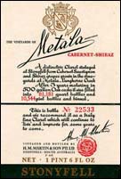
Another
of his labels for Stonyfell was the classic Metala. This all-text
label was based on the French Chateau Mouton-Rothschild label, and
may have been the first Australian label to include an individual
number for each bottle.
At the
same time he introduced colour coding of labels. This involved the
same design being used for all varieties but a different colour for
each, for example, a red background for port, fawns and browns for
sherries through to muscat, or pale greens for white wines.
More and
more of Morro's work involved the wine industry. Another of his innovations
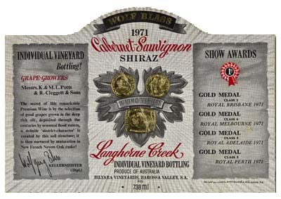
was the wrap-around label for Wolf Blass Wines. As well as the centrepiece,
it had two wings on either side, making the whole over 180 degrees
when attached to the bottle. This was more than labelling machines
could cope with, but Blass was so impressed with the design that he
agreed to have the labels put on by hand.
Wytt Morro
was responsible for what are probably the most beautiful wine labels
designed and printed in Australia - the Woodley Treasure Clarets of
1949 to 1956. Each of the eight
labels shows a rare Australian historical print, which is reproduced
in four colours on a paper stock of superior quality to that used
normally. Prints were chosen to reflect the qualities of the particular
vintages: a a portrait of Queen Adelaide was selected for the 1953
Claret, which was considered to be the most delicate and refined of
the eight, and a print of a racehorse decorated the 1956 vintage which
client, Tony Nelson, believed to be the strongest and gutsiest. A
portrait of Captain Cook was used for the most "masculine". All but
one of the wines were straight Coonawarras. The labels have been described
as "baseline trig points for any survey of Australian wine label
design".
Woodleys
Treasures series

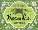
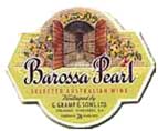
Perhaps
one of the most famous labels which Morro designed was for Orlando
Barossa Pearl. First released in 1956, the sweet bubbly played an
enormous part over decades in introducing thousands of Australians
to wine. Morro remembers that it was impossible to get the labels
on quickly enough, so a distinctively-shaped ceramic bottle was made
with the label being printed on glass and fired.
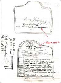
The collection
includes examples of the progress of a wine label from initial rough
sketches, through work sheets and instructions, to the finished label.
 Other
design labels with which he has been involved include: Other
design labels with which he has been involved include:
Mildara
Chestnut Teal Oloroso Sherry
(Audio - Wytt speaks
about designing the Chestnut Teal label)
Mildara
Hunter Coonawarra 1958 Cabernet Shiraz
Orlando
Barossa Riesling
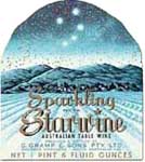
Orlando
Sparkling Starwine
Woodley's
Est 750ml & 1pt6floz
(Audio - Wytt speaks
about designing the Est label)
Woodley's
sherry 'Three Roses"
An
interview with Wytt Morro (requires Apple Quicktime)
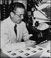
Excerpts
from a recent interview with Wytt Morro, conducted by Valmai Hankel:
|